Let me be clear, I have no formal education in graphic design. However, I have a good eye for geometric shapes and balance, and I am good at seeing what works.
During my many years as a web developer, I have often been caught up in tasks that require design skills, and I have worked a lot with layout of both printed and digital products. This has greatly increased my awareness of form and color, and it has given me solid knowledge of Adobe's software suite, especially InDesign, Acrobat, Photoshop, and Illustrator.
Below are some drafts and works from my portfolio. Hopefully, they show how I think, graphically. For me, it often comes down to exploiting the tension inherent in crookedness and in the interaction between symmetry and asymmetry, whether it is abstract shapes or recognizable motifs.
Click on the images to enlarge them.
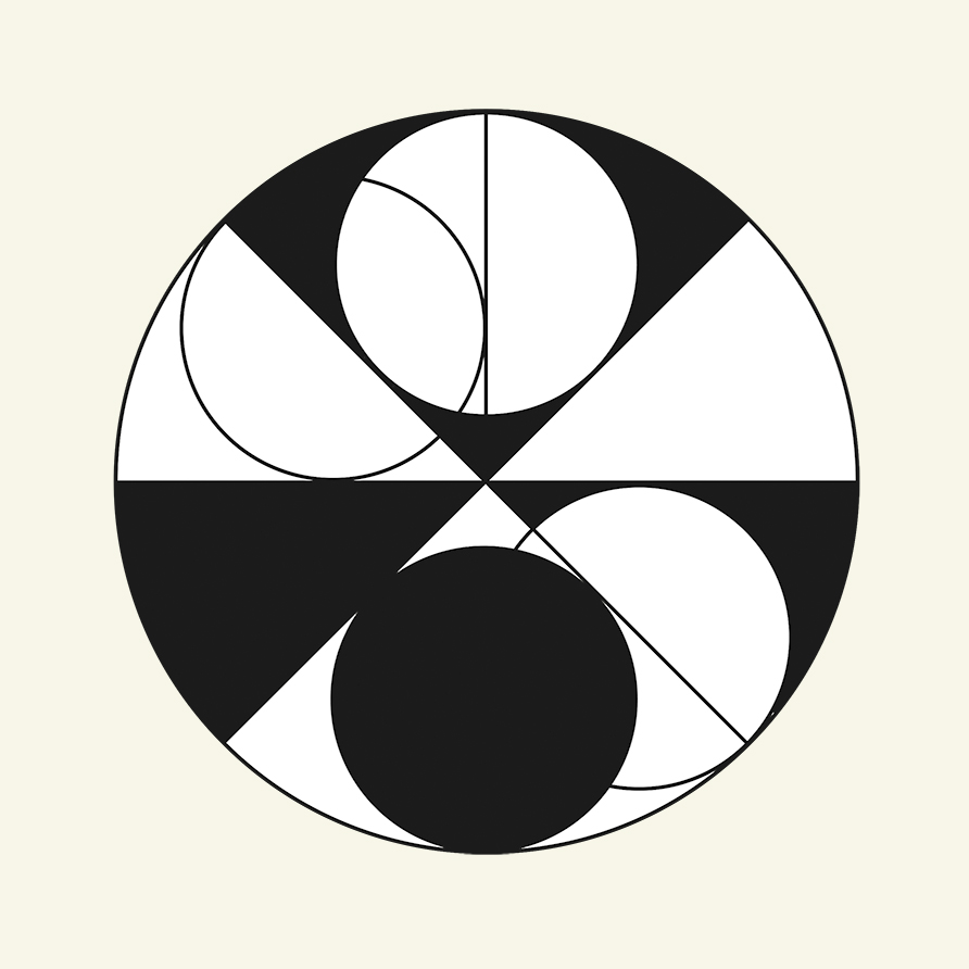
Sun and Moon (2019).
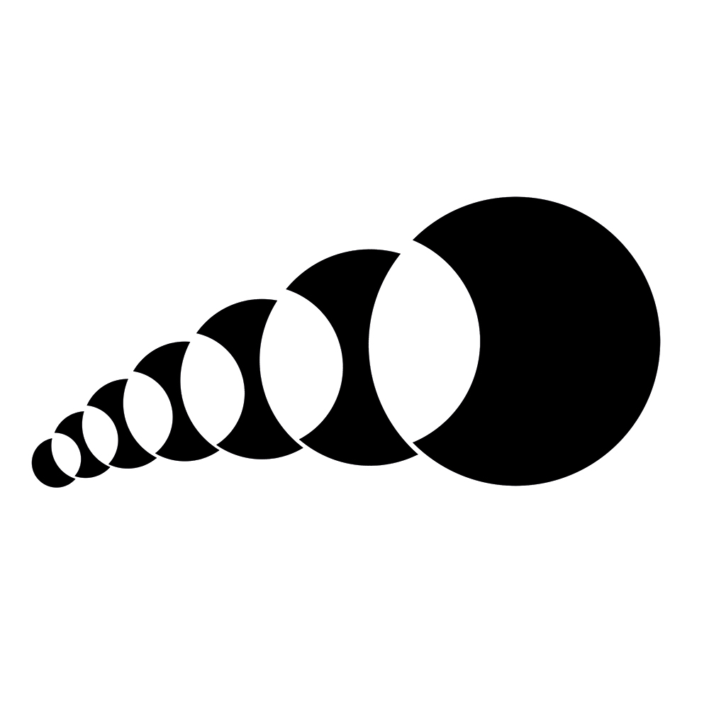
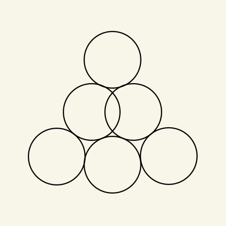
Broken Circles (2024).
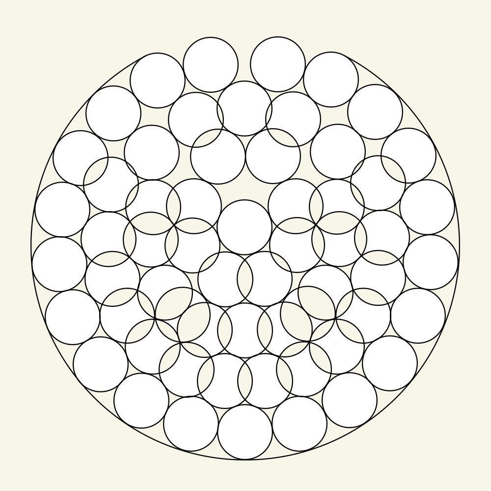
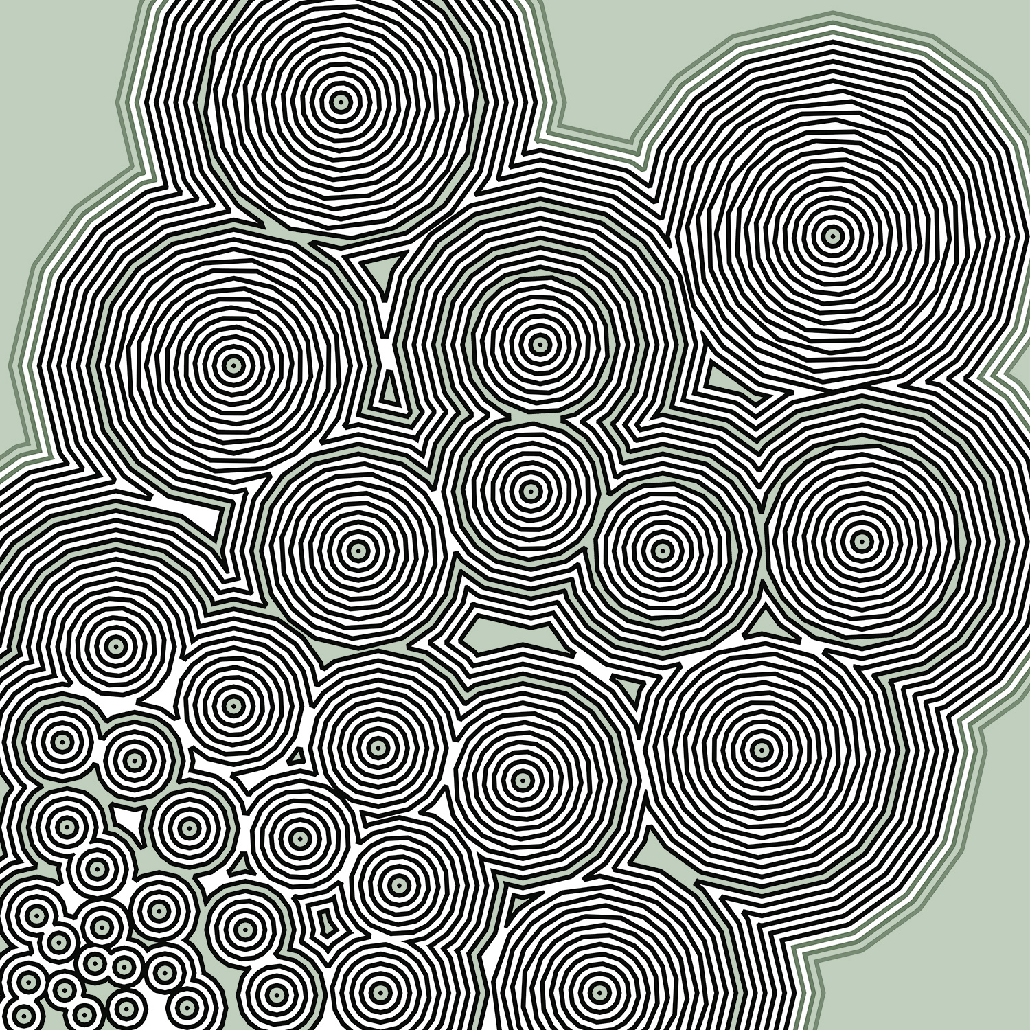
Nature of circles (2023).
Playing with circles (2023).
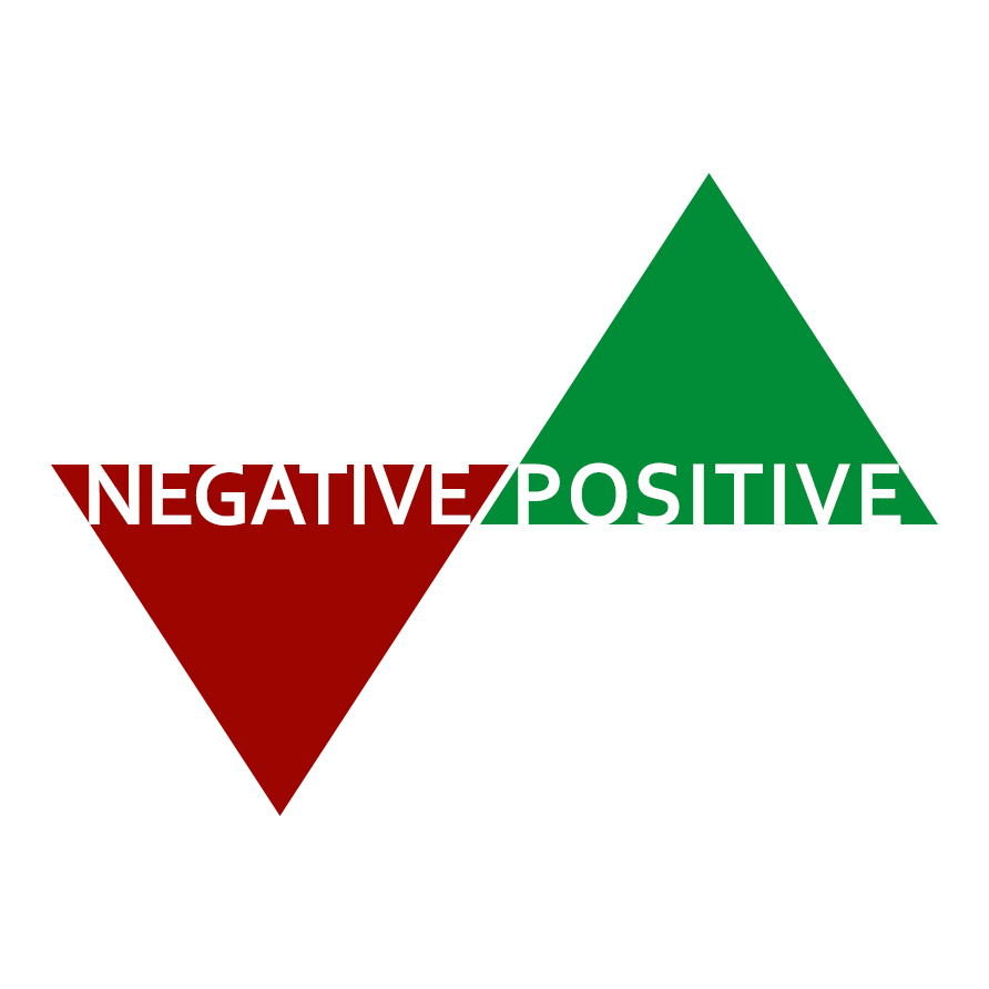
NEGATIVE/POSITIVE (2023). Sliding logotype.
GJ (2012). Logotype.
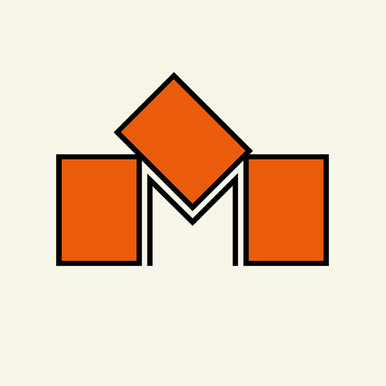
M (2014). Logotype / font draft. From the series "Boxes and Letters".
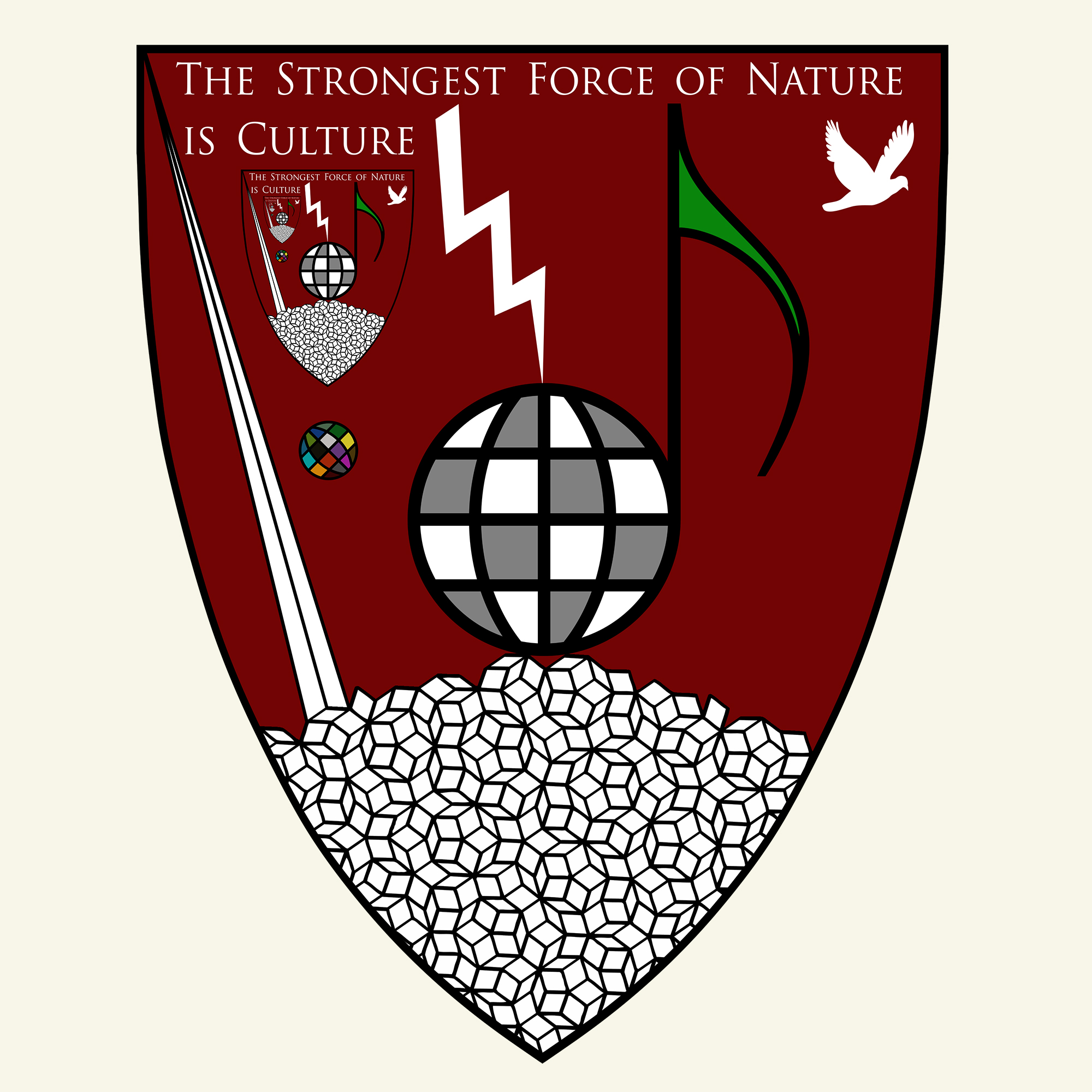
The Strongest Force of Nature is Culture (2014). Escutcheon.
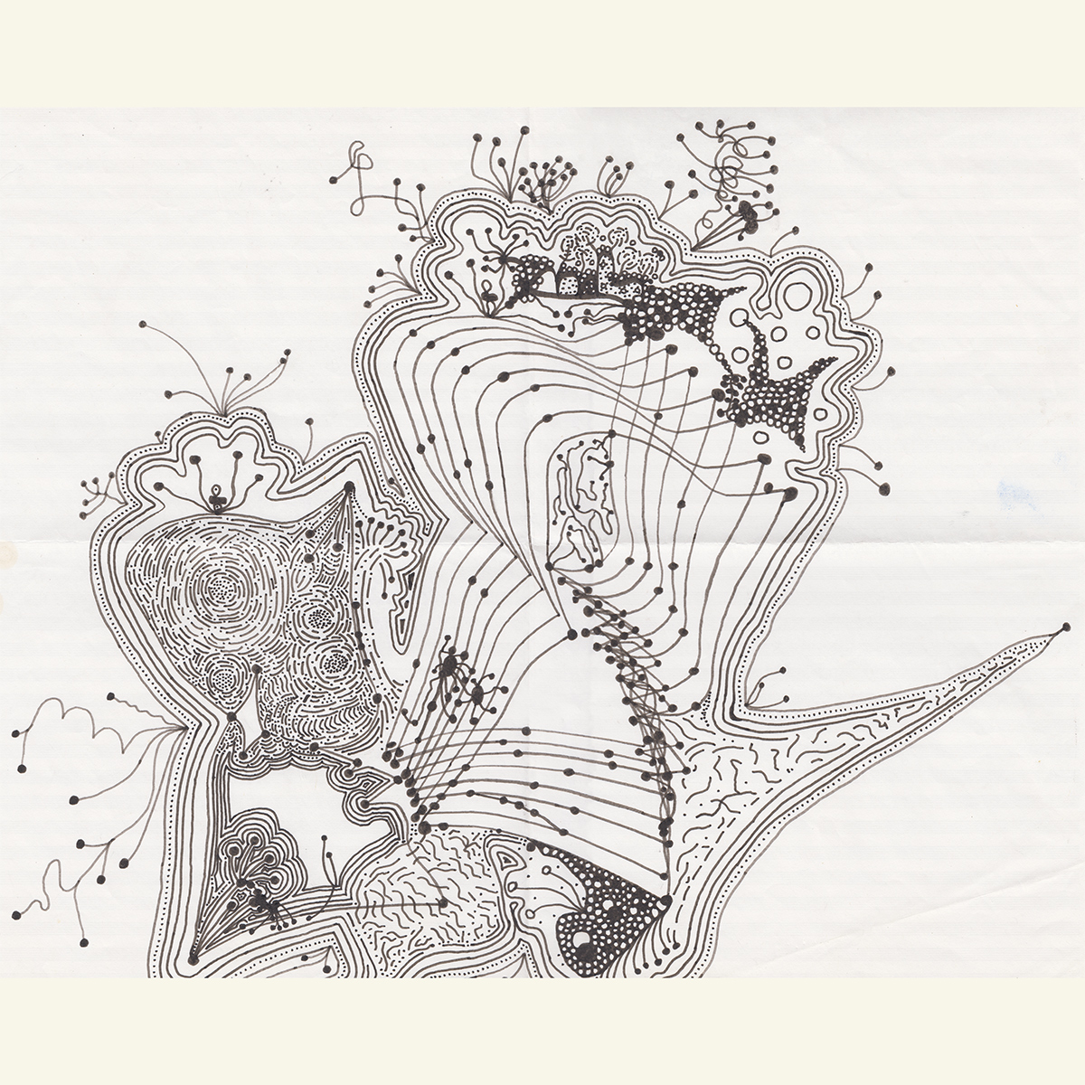
Lichen thought (2024). From the series "Line Algorithms".
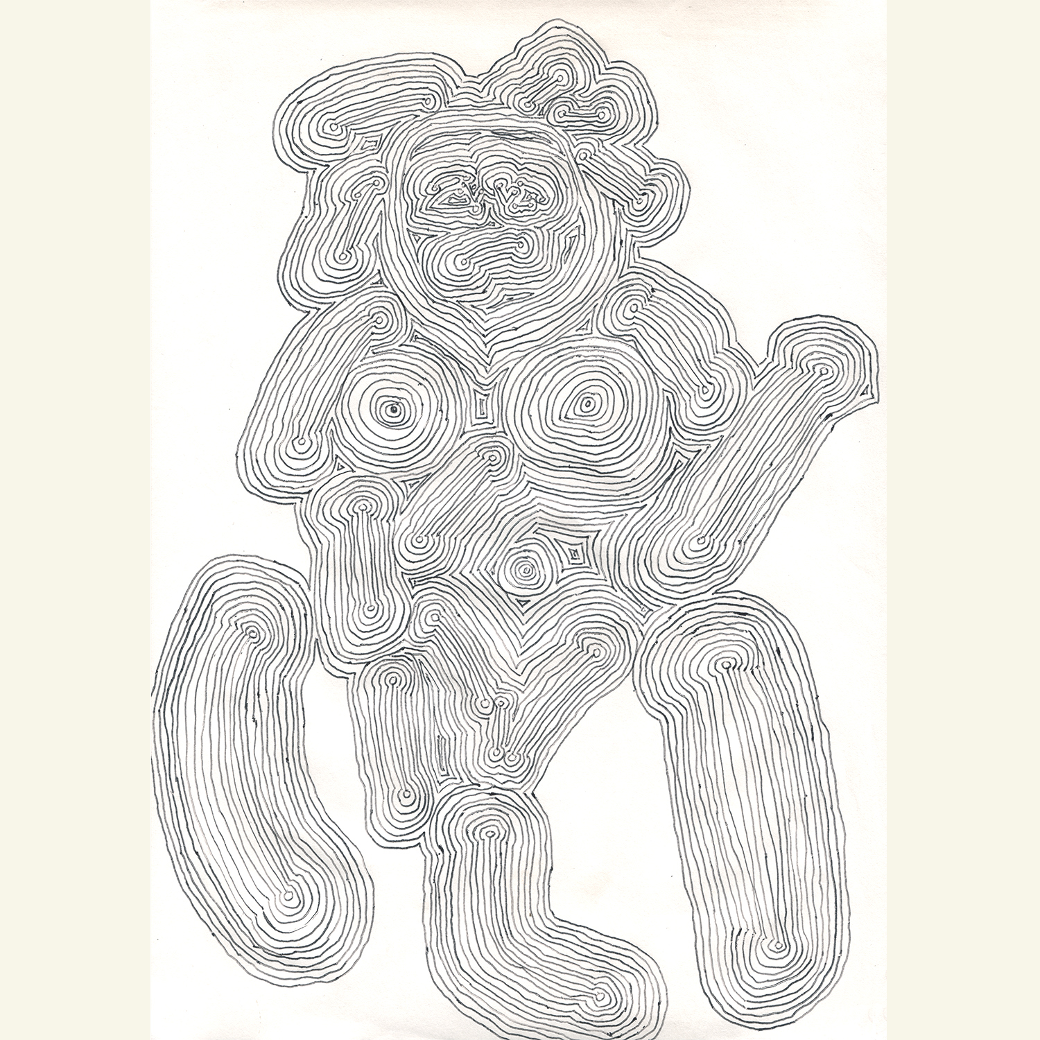
Society (2011). Ink on paper.
Delivery (2007). Ball-point pen on A4-paper.
Evolution (2007). Ball-point pen on A4-paper.
Sun and Moon (2019).
Broken Circles (2024).
Nature of circles (2023).
Playing with circles (2023).
NEGATIVE/POSITIVE (2023). Sliding logotype.
GJ (2012). Logotype.
M (2014). Logotype / font draft. From the series "Boxes and Letters".
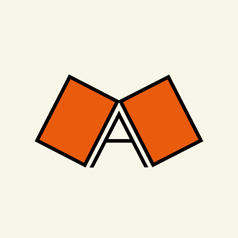
A (2019). Logotype / font draft. From the series "Boxes and Letters".
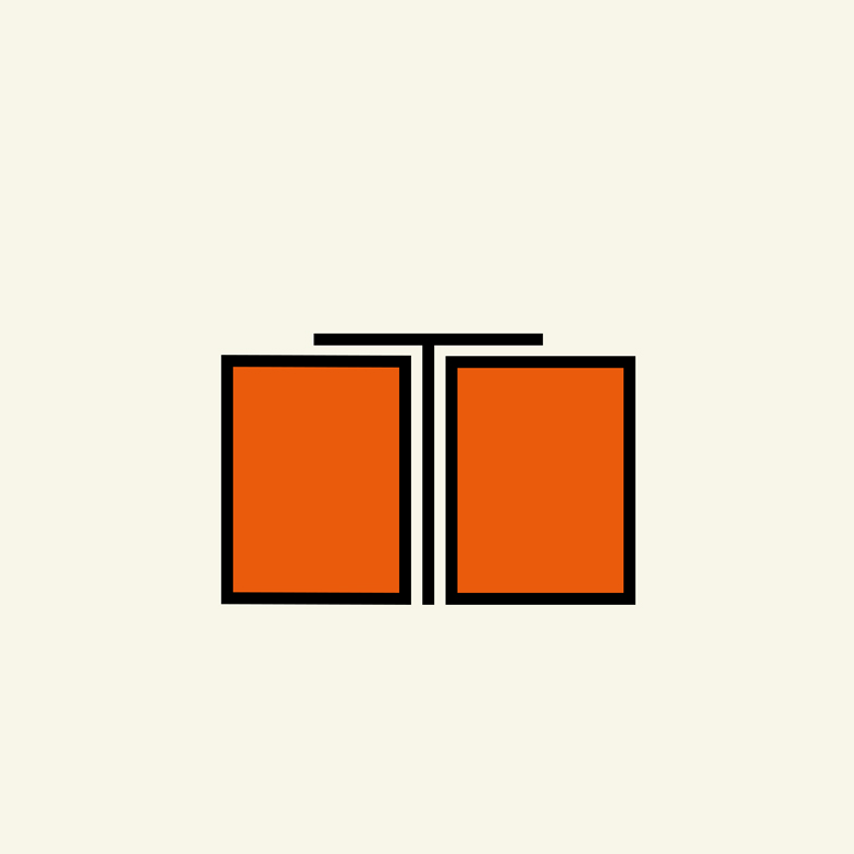
T (2019). Logotype / font draft. From the series "Boxes and Letters".
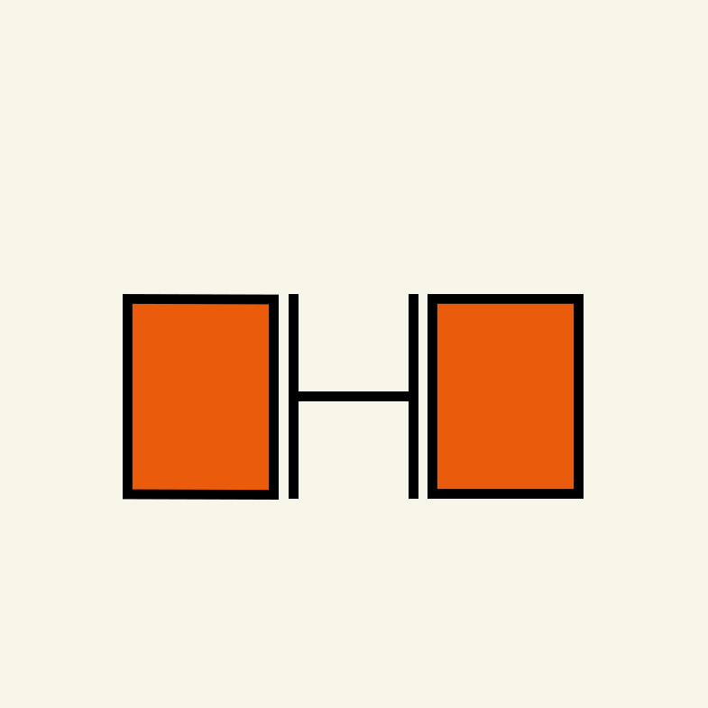
H (2019). Logotype / font draft. From the series "Boxes and Letters".
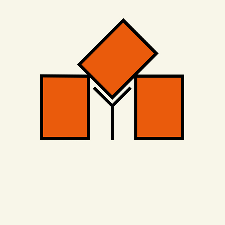
Y (2019). Logotype / font draft. From the series "Boxes and Letters".
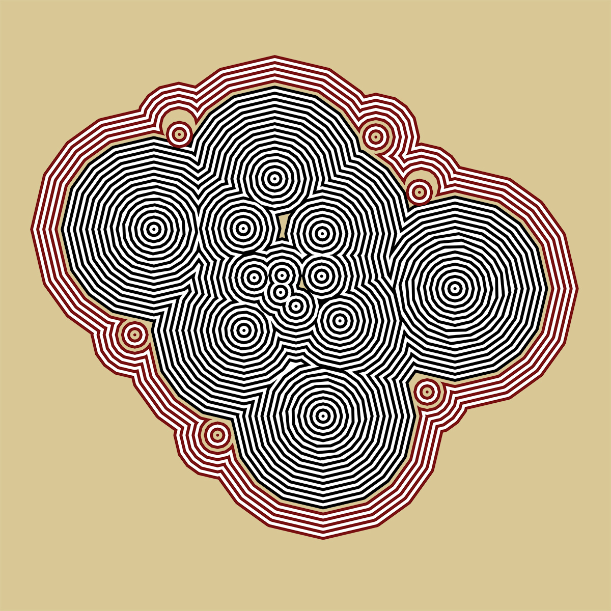
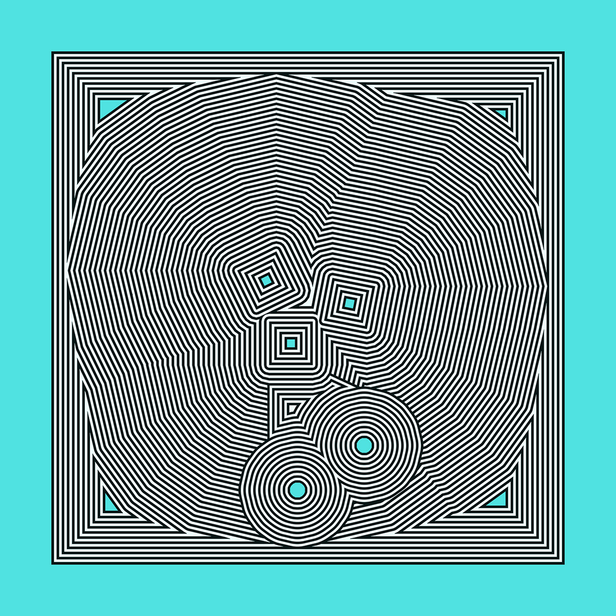
Surrounded (2024). From the series "Line Algorithms".
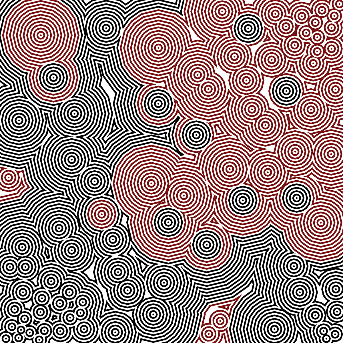
War or Peace? (2024). From the series "Line Algorithms".
Lichen thought (2024). From the series "Line Algorithms".
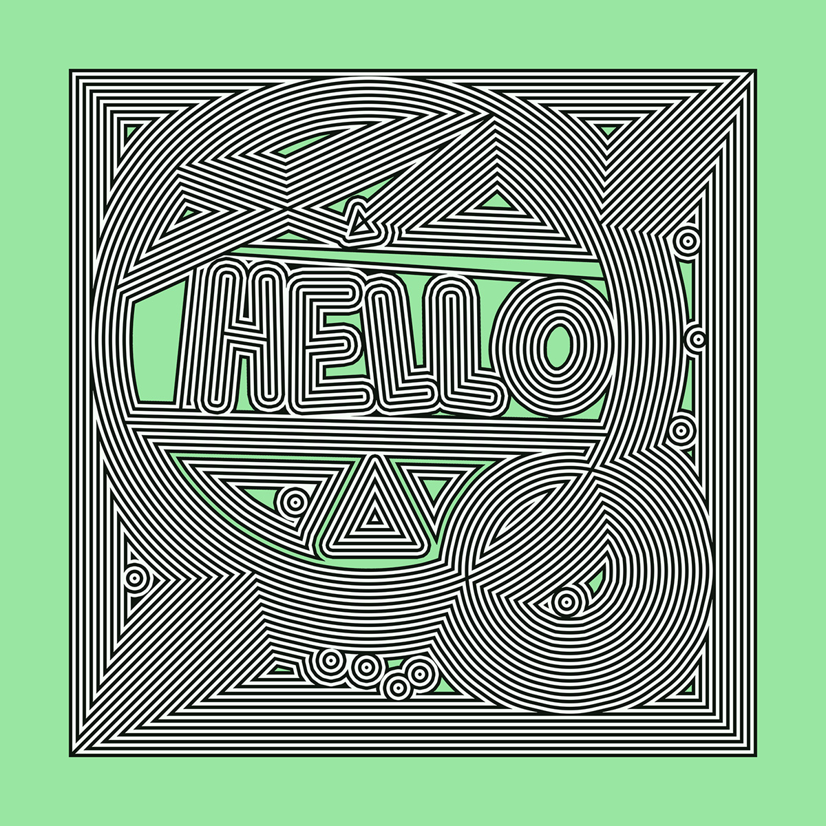
Hello (2024). From the series "Line Algorithms".
Outside the box (2024). From the series "Line Algorithms".
The Strongest Force of Nature is Culture (2014). Escutcheon.